
I Reviewed 500+ Portfolios: Tips from Ex-Head of Design
Creating a standout portfolio is a challenge, even for experienced designers. Why does this happen? 🤔

During my period as Head of Design at an Edtech, I've had the opportunity to review over 500 Product Design portfolios.
One surprising realization? Crafting a strong portfolio is no easy task!
In fact, a common pattern emerges in the mistakes I see time and again. Many portfolios suffer not from a lack of talent but from poor presentation. Overcrowded layouts, unclear narratives, and superficial case studies can often undermine the impressive work beneath.
Others struggle with over-polishing, prioritizing flashy visuals over clarity and substance.
P.S. I’ve attached my portfolio website at the bottom.
The Common Pitfalls in Product Design Portfolios
Let’s dive into three major tendencies I’ve observed that can seriously undermine a portfolio:

1. Neglecting Usability
It’s ironic that Product Designers, champions of seamless user experiences, often stumble when it comes to the usability of their own portfolios.
Overcomplicated Interactions: Fancy scroll effects, heavy animations, complex loading states, and cursor-following effects might seem impressive, but they often malfunction across different browsers or operating systems. These extras can distract from the actual content, and in some cases, leave the reviewer confused about how to navigate your site.
Password-Protected Pages: While some projects might be sensitive, placing them behind a password gate isn't ideal—unless the password is provided upfront in the application. It's the designer's job to ensure easy access for reviewers.
"Coming Soon" Projects: If you’re actively seeking a job, all projects should be accessible. Displaying incomplete case studies adds unnecessary friction to the experience.
Broken Links: It’s shocking how many portfolios have broken links, especially those leading from the main thumbnail to the case study. Thorough QA before publishing is crucial.
Portfolio Only Available for Download: This approach feels outdated and may prevent some reviewers from accessing your work, especially if company policies restrict downloads.
Lack of HTTPS Protocol: If your website is flagged as insecure by browsers, reviewers might be hesitant to open it.
Not Mobile-Optimized: With most web traffic coming from mobile devices today, your portfolio must be mobile-friendly. While it's safe to assume recruiters will use desktops, they might share your link with others who access it on mobile devices.
To avoid these pitfalls, I highly recommend conducting a couple of usability tests with friends or family to ensure everything works smoothly before sharing your portfolio.
2. Lack of Context
Context is the backbone of any compelling story, and portfolios are no different. Without sufficient background information, your narrative may come across as disjointed, leaving reviewers confused.
High-Level Context: Many designers forget to introduce themselves, their backgrounds, or the companies and projects they’ve worked on. This lack of context can lead to missed opportunities for building trust with potential employers.
Case Study Context: When presenting a project, designers often dive straight into the details, overlooking the importance of providing an overview of the product, the problem it addresses, and the team involved. Additionally, it’s crucial to clarify your role—were you freelancing, part of an agency, or working in-house?
3. The Work Doesn’t Speak for Itself
While the saying "good work speaks for itself" might hold true in art or fashion, it doesn't apply to product design. It’s our responsibility to guide the reviewer through our work and highlight the thought process behind it. Common mistakes I’ve noticed include:
Project Thumbnails Without Titles: Unlike visual design disciplines, product design relies on text as much as it does on visuals. A title can provide essential context and intrigue the reviewer to delve deeper into your case study.
Mockups Without Annotations: This is a frequent issue. Even if a mockup is related to a specific section, it can still be challenging for reviewers to understand what to focus on. Adding titles, annotations, or even blurring out irrelevant sections can help clarify the purpose of the mockup.
Thumbnails Linking Directly to Live Products: Providing a link to a finished product or website without a case study doesn't offer the reviewer any insight into your process. The story behind your work is what they’re really interested in. In some cases, the final product has evolved so much that it no longer matches the visuals in your portfolio!
Final Thoughts
Creating a compelling Product Design portfolio is an art in itself. It requires careful thought, attention to detail, and multiple iterations to perfect the narrative of your work.
Always keep usability, context, and clear communication in mind—your designs won't speak for themselves without your guidance!
Until next time,
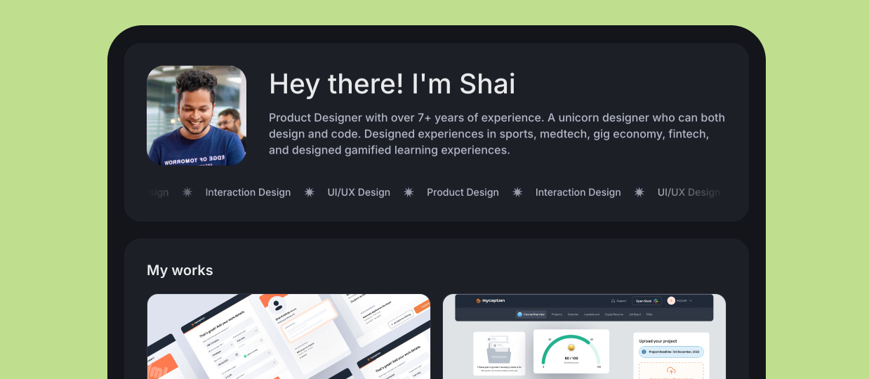
Shai
P.S. Here’s my personal portfolio site:
I built this under 20 mins using Designfolio.me
Thanks Shai for sharing this useful tip.❤️